CyFox Dashboard Redesign Case Study
Background
CyFox provides advanced cybersecurity solutions to protect organizations against evolving threats. The existing dashboard, while functional, lacked user-friendliness and clarity, making it challenging for users to navigate and utilize its features effectively. As the Lead UX Designer, my mission was to redesign the dashboard to improve user experience and drive higher engagement, ultimately boosting revenue.
Objective
The goal was to redesign the CyFox dashboard to enhance usability, streamline data presentation, and improve overall user satisfaction, leading to increased customer retention and revenue growth.
Research and Insights
1. User Feedback:
- Collected insights from current users to identify pain points and desired improvements.
- Focused on simplifying complex information and making key features more accessible.
2. Competitive Analysis:
- Analyzed competitor dashboards to benchmark best practices and identify areas for differentiation.
3. Usability Testing:
- Conducted tests with prototypes to gather user feedback and refine the design.
Key Design Challenges
1. Complex Data Presentation:
- Users needed a clear, concise way to interpret vast amounts of security data.
2. Intuitive Navigation:
- The previous dashboard had a steep learning curve, requiring a more intuitive layout.
3. Real-Time Updates:
- Ensuring users could access real-time data quickly and easily.
Design Solutions
1. Simplified Data Visualization:
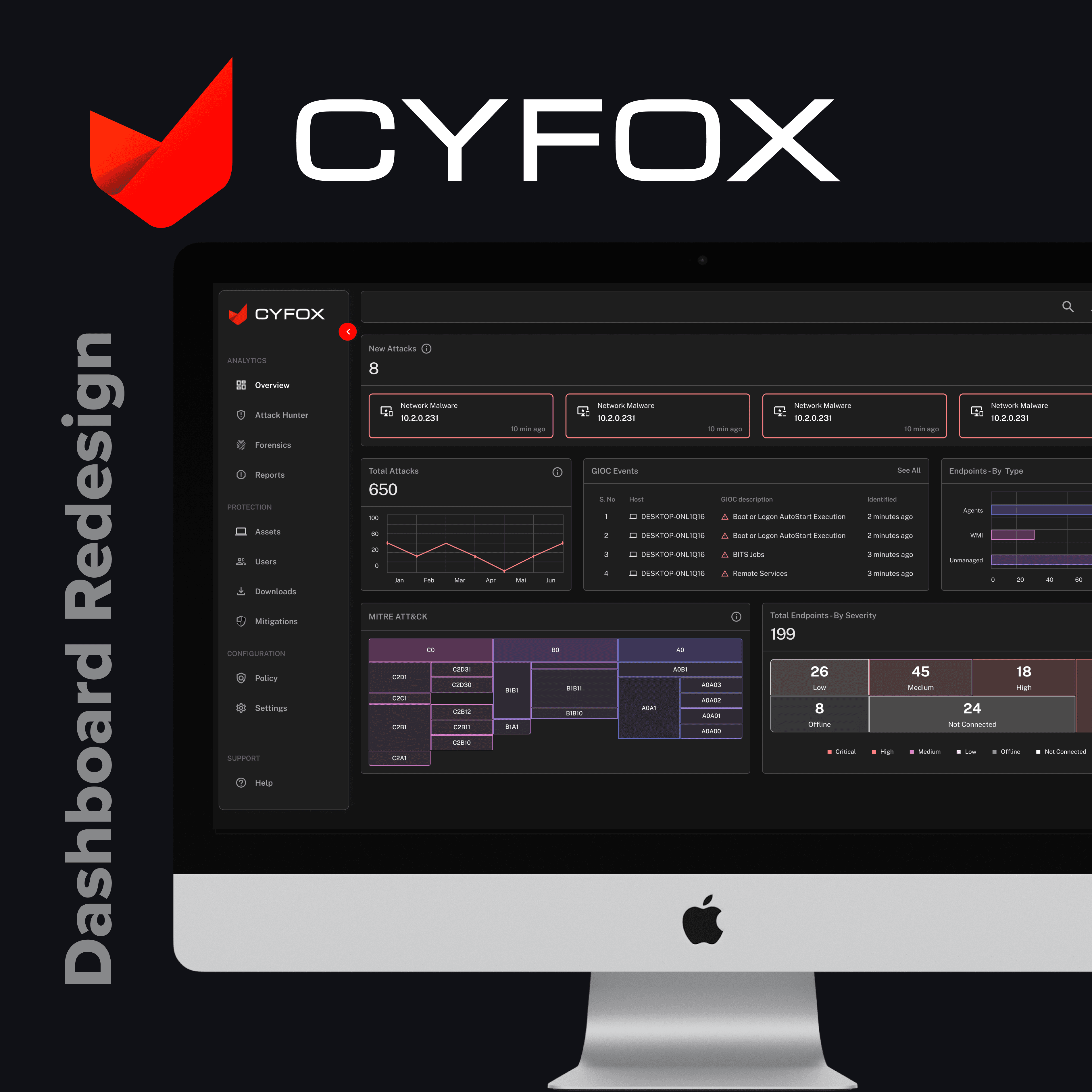
- Implemented clear and concise charts and graphs to present complex security data.
- Prioritized important metrics and alerts to help users focus on critical information.
2. Improved Navigation:
- Redesigned the layout to create a more intuitive and user-friendly experience.
- Included a sidebar with categorized sections for easy access to different features.
3. Real-Time Data Access:
- Ensured the dashboard provided real-time updates and alerts, allowing users to respond promptly to threats.
Results
- Enhanced User Engagement:
- The redesigned dashboard led to a 30% increase in user engagement, as users found it easier to navigate and utilize features.
- Increased Revenue:
- The improved user experience contributed to a 20% rise in subscription renewals and new customer acquisitions, significantly boosting CyFox's revenue.
- Positive User Feedback:
- Users praised the clear data presentation and intuitive navigation, leading to higher overall satisfaction and loyalty.
Conclusion
The CyFox dashboard redesign successfully addressed key user pain points, making the platform more intuitive and user-friendly. The improved design not only enhanced the user experience but also drove higher engagement and revenue, proving the value of a user-centric approach.
Future Steps
1. Ongoing User Feedback:
- Continuously gather user feedback to make iterative improvements.
2. Advanced Features:
- Introduce new features based on user needs and feedback, ensuring they are easy to access and use.
3. User Training and Support:
- Provide comprehensive training and support resources to help users maximize the benefits of the redesigned dashboard.