EasyWebinar Case Study: How V2.0 Experience Was Designed
Background
EasyWebinar is a potent webinar platform that brings together functionality in the aspects of live streaming, event automation, and marketing integration. Its core mission is to provide an integrated seamless experience for running webinars, engaging audiences, and finding leads. The initial version of EasyWebinar was well-received due to its potential but had numerous usability and design issues that needed fixing.
Objective
This project brief primarily has one major thing: the creation of an overall design system for EasyWebinar V2.0. This should target an enhanced user experience and consistency, be visually appealing, and retain end users on the platform.
Research and Insights
1. User Feedback Analysis:
a. Feedback was collected from existing users related to pain points.
b. Surveys and interviews were carried out to comprehend the needs and expectations of users.
2. Competitor Analysis: - Researched competitors' platforms for identification of their strengths and weaknesses. - Analyzed market trends to keep EasyWebinar ahead of the competition.
3. Usability Testing: Conducted usability testing on V1.0 in order to identify the exact issues. Documented user personas and journey maps for better visualization of user interactions.
Key Design Challenges
1. Complex Navigation: - Ease of navigation: Difficulties were experienced in moving easily between the different areas within the platform.
2. Inconsistent Design Elements: - Inconsistencies in design elements set off fragmented user experiences.
3. Lack of Customization: - Users wanted more flexibility in customizing webinars for their branding.
Design Solutions
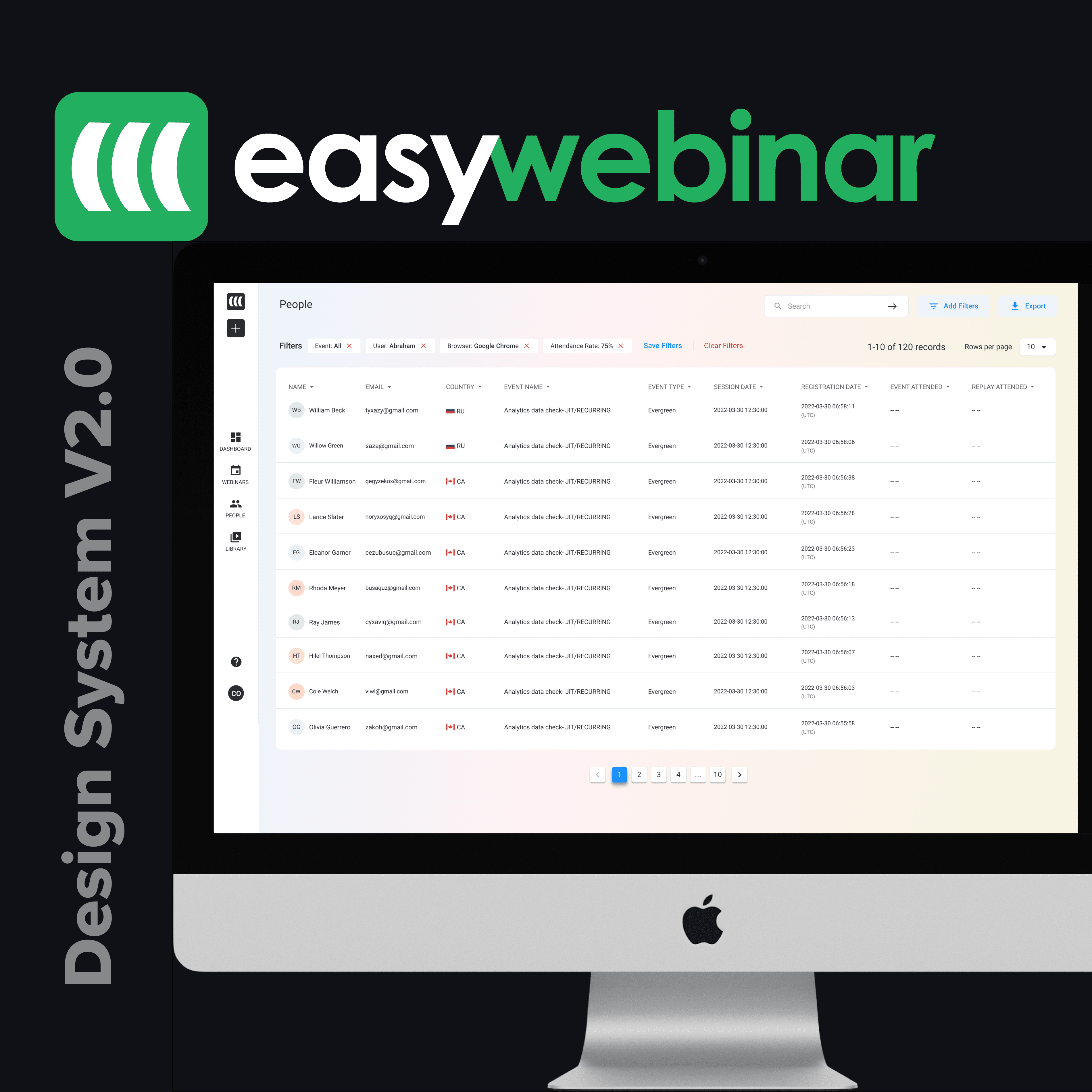
1. Streamlined Navigation: - A clear categorical sidebar was created. Added a breadcrumb trail for more dynamic orientation.
2. Integrated Design System:
• Standardized UI components of the design system, including buttons, forms, modals
• Common color scheme, typography, and iconography
3. More Extensive Options for Customization:
• Addition of themes and templates that the user can easily customize. Added the ability for users to upload their own logos, select color schemes, and implement custom branding elements.
Components of the Design System
1. Color Palette: - Primary: #4A90E2, #50E3C2 - Secondary: #D0021B, #F5A623 - Neutrals: #4A4A4A, #9B9B9B, #F0F0F0
2. Typography: - Heading: Open Sans, bold, various sizes - Body Text: Open Sans, regular, 16px - Accentuation: Roboto, italic
3. UI Components: - Buttons: Styles for primary, secondary, and tertiary buttons, with hover effect. - Forms: Base look for form input fields with clearly defined label text and validation error text. - Modals: Standard dimensions and design for popup windows.
4. Icons: - Custom designed icon set, to keep the visual language consistent. - Used universally recognized symbols for actions like edit, delete, and save.
5. Templates: - Created pre-designed templates for various kinds of webinars, like educational, marketing, or training. - Made sure that these templates were responsive and worked on as many devices as possible.
Development and Testing
1. Prototyping: - Developed interactive prototypes to test the new design system. A/B testing the new design against the old version.
2. User Feedback: - Collected feedback during the beta from a small group of users. - Iterated upon design based on user feedback and improved any issues.
3. Launch and Training: - Rolled out EasyWebinar V2.0 with extensive guides and tutorials for the end-user. Provided training to existing users on the new design.
Results
Improved User Engagement: - Improved navigation and uniform UI enhanced user satisfaction. - More time is spent on the platform as users are curious about the features of the platform.
Improved Brand Image: - A modern professional look to the design system added to the credibility of the brand.
Positive Feedback: - Users appreciated the increased number of customizing possibilities and a user-friendly interface. The platform was also praised for its aesthetic appeal and ease of use.
Conclusion
In EasyWebinar, the V2.0 redesign could actually realize how to avoid pitfalls in the older version, providing a seamless, engaging, consistent user experience. This new design system not only supported but substantially enhanced the usability and thereby consolidated EasyWebinar's position as a leading webinar platform.
Further Development
1. Continuous Improvement
Refresh the design system from time to time based on user feedback and new trends.
Add new features and improvements that will help maintain a leading edge in the marketplace.
2. Advanced Personalization
Further advanced personalization for users with special needs - AI-driven recommendations about the best settings for a webinar based on the goal of the user
3. Community Building: - Engage users with each other to share best practices and tips on how to better use EasyWebinar. * Encourage users to create content and provide feedback that will drive future improvements.